
Designing for Inclusion - the design guide
Dr Anna Tsalapatanis
|
Completed in partnership with: |

About this guide
Front line advice workers are experts in knowing what information to give to people and communities. Drawing on good practice in the sector, this guide focuses on how to best present advice and information in ways that are accessible and easy to understand. This guide has been designed with the needs of smaller organisations in mind, especially those who may not have a dedicated communications officer or team. It is designed to be brief but contains many links to further resources including specialist national organisations. This guide is also available in pdf format.
The guide is split into six key sections, with additional information in the appendices at the end. The six sections are:
Who are you Designing for?
This section considers steps to take when reflecting on who your users are and what the best information formats are for them.
The Design Process: Define, Research, Create, Test, and Redesign, and Monitor
This section discusses the lessons that can be learnt from best practice in the design world including the need for testing and evaluation.
General Guidance
This section provides a general overview of the guidance that applies to most information formats including subsections on use of language and how to find or make the right images to accompany the information provided.
Format Specific Guidance
This section focuses on good practice in producing websites, print materials, digital documents, podcasts, films and social media outputs.
Accessibility and Inclusivity Considerations
This section looks at the things we should keep in mind when engaging with certain groups such as those with low literacy, neurodiversity, learning disabilities, low vision or a sight impairment, hearing impairments, or those who are non-native users of English. It also includes information about how to be inclusive and diverse in your choice of language.
Working with External Suppliers or Freelancers
Finding the right people for the job and working with them to create what you need is not always simple. This final section provides guidance on how to find the right experts, provide them with a brief, and make sure you get the most out of the process.
Who are you Designing for?

The advice sector serves a diverse range of people, who have different circumstances, needs and abilities. This may include clients who are living in temporary or long-term poverty or who are digitally disadvantaged. It also includes the neurodiverse, sight or hearing impaired, differently abled or those who are hard of hearing, illiterate, have limited vocabularies or a low reading age. In addition, advice services vary considerably in terms of their resources. The diversity of the sector and its clients means that one size will not fit all.
It is impossible to design a resource that meets the needs of everyone, especially when you serve a wide-ranging client base. Representatives from the advice sector told us that a first step in producing information is to consider exactly who your users are as this will influence what the most suitable information formats will be. For example, users of a university student advice service will need different sorts of information to that given to non-English speaking migrants.
Even within broad client groups there may be certain conditions, limitations, or circumstances that you will need to consider when producing information such as neurodiversity or visual impairment. If you are creating information targeted at a particular client group, it is useful to think about what will best suit their needs. For example:
- Parents with young children might not have much control over their time and may find it difficult to leave the house. One advice worker we spoke to said that they had success in producing podcasts and webinars for this audience.
- Certain communities, such as the Roma, may be wary of official documents so it might be a good idea to remove official logos from resources created for them. They may also face challenges with literacy so written documents in English may be unsuitable.
- It is not always those who need assistance for themselves who reach out for information. Carers, adult children, or professionals such as doctors may also seek the support of the advice sector. These proxies may have different information needs.
It is worth considering who is most likely to use the information you produce so that you can tailor it to their needs. AdviceUK has produced a guide with 10 practical tips to keep in mind when using this approach.

Online is not a solution for everyone
While the digital world makes accessing information far easier for many, a significant proportion of the population do not have access to a computer, smartphone, reliable bandwidth or the right digital skills to complete tasks online. Moreover, even those who use the internet regularly, may have developed skills that are limited to a small range of devices or applications. Evidence shows that digital disadvantage frequently intersects with other forms of vulnerability and disadvantage. If your client group is likely to include those who are not tech savvy it is important to make sure that you have resources for them. For more information about digital poverty, see this Digital Poverty Alliance Report.
Design for accessibility
Making something accessible can sometimes reduce the number of design options we have. Certain types of fonts, font sizes, colours that contrast and simple lay outs will make the resource you are creating more accessible and easier to follow. We recommend prioritising accessibility over design.
Recognising the value and knowledge in existing organisations and community groups
Seeking feedback from those within the community you serve, or colleagues who work closely with them, can be the best way to test whether the resource you have produced is fit for purpose. Representatives of the advice sector told us that they often check the resources produced by other community groups before creating their own. Some mentioned that where community groups have a shared goal, they may even collaborate in producing a resource.
The Design Process: Define, Research, Create, Test, Redesign, and Monitor

Designing resources is not a linear or single step process. Ideally, it involves several stages of planning and testing. Practice led research suggests that thinking of design as a process can improve the resources we create.

The above diagram shows the various stages in the design cycle. These stages are described and outlined in more depth here:
1. Define
Work on clarifying what you want to achieve.
- Who is your audience? What are their needs?
- How much information or advice is it essential to convey?
- What is the best format for this particular audience?
- How much money and time are you able to spend on producing a resource?
- Do you have the skills to produce the resource in-house or will you have to find people with the right design/linguistic/technical skills to help you produce it?
2. Research
Sometimes it can be difficult to know what will work, and it may be useful to collect further information before you get started. The exact type of research will depend on what you are doing but it is helpful to consider:
- What questions do I need answered to choose the right format and approach?
- Who can provide answers to those questions? In particular, are there insights I can get from potential users in advance to help me?
- Are there successful examples of the resource that I can learn from?
- Are there people with experience who can guide or help me?
3. Create
The next step is to go about mocking up a resource which draws on the advice in this guide. It might be a good idea to produce more than one draft so that you can test out with colleagues or clients which of them conveys the information in a clear format and accessible way.
4. Test
Testing is a very important step. While we may put our very best efforts into design, there are usually things we have overlooked or can improve on. A frequent piece of advice we received from representatives of the advice sector was to assume nothing and talk to your users. Getting feedback can be done in several ways, with varying levels of structure and formality. Some organisations have set up user committees that meet regularly, while others just ask for informal feedback from communities about a particular item. How you do it may well depend on your resources or approach to working with your community.
5. Redesign
It is important to ensure that you improve the resource you are producing based on insights gleaned during research and consultation.
6. Monitor
Checking resources and keeping them updated is really important. Pay attention to the ongoing suitability of the content and its usefulness. There is a danger of investing a lot of time in a complex resource that then goes out of date quickly. Think about the shelf life of a resource and whether, and how, it can be refreshed or updated. When creating a resource it is a good idea to factor in the need for a named person to review it at regular intervals.
General Guidance Across Formats

There is a range of general guidance to make the materials we design more accessible. This section will offer examples of this including simplifying language, keeping things short, structuring your ideas clearly, catering to different learning styles, as well as finding or making suitable images for your work. This section is divided into three sub sections: language use, structure, and image use.
Language Use
Clients may struggle to understand complex or technical language. This is not surprising given that:
- Nine per cent of the UK population do not speak English (or Welsh in Wales) as their main language.
- Over 16 per cent of adults in England (7.1 million people) have ‘very poor literacy skills’.
- The average reading age of people in the UK is just 9 years old.
Advice sector experts we spoke to stressed the importance of using simple language, and where possible the sort of language that is familiar to your users. Some key points to keep in mind include:
- Be cautious about using technical terms and where possible avoid them by using simpler word(s) e.g., ‘doctor and nurse’ rather than ‘clinician’ or ‘work with’ rather than ‘collaborate’. The UK government has published a list of words to avoid to enhance understanding.
- Where this is unavoidable because the term is one people will inevitably come across, explain what it means.
- Avoid using metaphors or colloquial phrases e.g., use ‘easy’ rather than ‘it’s a piece of cake’.
- Use inclusive language wherever possible e.g., don’t use gendered language such as ‘policeman’ or ‘policewoman’, use ‘police officer’. There is a section later in this guide which provides further information about using inclusive language.
- Use ‘you’ and ‘we’ as much as possible, instead of the third person e.g., ‘you will’ rather than ‘the applicant will’, as this engages the reader more directly.
- Write in active rather than passive voice e.g., ‘you fill in the form’ (active) rather than ‘the form is filled in by you’ (passive). There are however cases where the passive voice should be used to minimise blame, such as ‘the bill has not been paid’ (passive) instead of ‘you have not paid the bill’ (active).
- Avoid abbreviations and acronyms where possible. Where this is not possible, explain them clearly and simply. Make sure all acronyms are provided in full the first time the term is presented E.g. Department for Work and Pensions instead of DWP.
- Keep sentences short, preferably less than 15 words. Using sentences of different lengths can also make the writing more engaging.
- A number of people we spoke to in the advice sector make use of a system called ‘easy read’. Further details of this can be found in the box below.
- You can also check your writing using online tools such as the Hemingway app, which give general advice about making text simpler.
- For further advice about writing in plain English see this plain English how to guide.
Using Easy ReadEasy read is a system which can help you communicate effectively with people who have difficulty understanding written information. It is more simplified than ‘plain English’. Easy read uses simple everyday language supported by pictures. While it was originally designed to help people with intellectual disabilities, the key principles are useful for a wider range of users. These include using short sentences, simple language, explaining complicated terms, using large fonts and providing an image to represent each sentence. Producing easy read materials is best done by a trained professional. We encourage you to either get training for members of your team or commission an easy read version of the text. Even with suitable training, it is a good idea to get an expert in the field to review any work you produce. For further information and resources on easy read:
|
Structure
How you structure information is very important:
- Make sure your information is easy to navigate by breaking it up into sections and paragraphs.
- Each section should have a central purpose and idea. Each idea should follow logically from one to another.
- Use headings and titles that clearly describe the information that will follow.
- Consistent types of headings and subheadings can help users navigate through the information and identify what is important.
- Use lists and bullet points to break down information into key steps or ideas that are easy to digest.
- Provide a summary or recap at the end of the document, film or podcast, as this will reassure those reading or listening that they have captured the key messages.
- Processes can also be simplified by presenting them in the form of a flowchart that breaks things down into clear and easy steps. These can be easily produced within most word processing applications.

An example of a simple flowchart
Learning Styles
Research has shown that people pick up and retain information in different ways. Some people learn best through listening while others prefer images or reading. It is a good idea to include information in more than one of these formats where possible. For example, if you were making a film, it would be a good idea to include captions, or some summary text at the end.
Using Images
The old adage that a picture paints a thousand words continues to be relevant today. Images help you convey a message, illustrate something that you have in the text and provide variety. Research has shown that:
- People pick up messages from images much more quickly than from reading text.
- People may only use images and ignore text where their literacy level is low.
- It is important not to use images which contradict text or detract from the key message being conveyed.
- To convey meaning effectively, images and graphics also need to be culturally and age appropriate for your audience.
- If you want clients to believe that you are producing information for people like them, it is important to represent diversity in the images you use. This includes body shape, age, gender, sexuality, ethnicity, culture, and customs. This is to encourage people to ‘see themselves’ in the content that is provided.
- Regardless of the way you source them, it is important to make sure that any images used on websites or in digital documents include alternative or ‘alt’ text. This provides a brief description of what is conveyed by an image for those with low or no vision. This text can also be picked up by a screen reader. In different programmes this is done in a variety of ways. To add alt text in Microsoft Word, right click on any image you have inserted and select ‘View alt text…’. This allows you to add a description. If you are using a decorative image that does not bear any relation to the text, an empty alt text tag should be used. If you are having trouble deciding whether an image needs alt text here is a helpful decision tree to help you make that choice.

Do I have the right to use an image I find on the internet?
It is very easy to source images from the internet e.g., copying one straight from Google Images. However, many of these images are subject to copyright. If in doubt, it is probably best to assume that you do not have the right to reproduce them and avoid your organisation receiving a copyright infringement notice. Instead you can purchase images, use free images, make your own or commission someone else to produce photographs or graphics for you.
Purchasing Images
There are a whole range of providers on the internet that have banks of images you can buy. The value of their sites is that they often contain thousands of pictures for you to browse at the click of a mouse. These sites are not limited to photographs, and many also offer templates for posters, PowerPoints, infographics, icons, graphics, and backgrounds. Many of these companies offer a free trial. You could sign up for a trial to see if the images produced by that provider suit your needs, and then cancel if it they do not. Some examples of reputable sites that sell photos include:
When you pay for an image online you are likely to be asked some questions about approximately how often you want to use it or how many people the resource you are producing will be distributed to. The price you are charged may depend on your answers.
Using free images
Some websites allow you to use their images for free subject to certain conditions. The following are examples of sites that offer free images:
Using free images commonly involves you acknowledging the name of the person who took the photo and the website you found it on. The rules that apply will differ between websites. These free images are still licensed, but usually under a Creative Commons license. You will notice in this guide some of the images acknowledge the source of the photographs. These are the ones that were obtained free via Unsplash. Others that do not have an attribution were obtained through a paid subscription to Envato Elements.
Making your own photos
Many people now have an excellent camera with them every day in the form of a smartphone. You can find some tips on taking better photos in the box on this page. If people are identifiable in the photos you take, you will need to get their consent to use the images. You can do this by asking them to sign a photo release or consent form. We have included a very simple example of this in Appendix Two which you can customise to for your organisation. For large events, it may be simpler to let those attending know that filming/photography will be taking place and to ask them to let the organiser know if they object to their images being used.
Top tips for taking photos

|
Having images made
A final option which is likely to be more expensive than the others, is to ask someone else such as a photographer, graphic designer or illustrator to produce an image for you. The advantage of this approach is that you can have high quality images made exactly to your own specification and in a style that suits the needs of your organisation. We provide some information about commissioning work later in this guide.
Format Specific Guidance

Picking an information format
The formats discussed in this section require different levels of skills and expertise to create. It is important to keep in mind that in some cases time consuming resources that are well designed might be more effective. As one of our focus group participants advised us: ‘labour intensive does not mean labour inappropriate.’ In the end you are likely to be the best judge of what information format is most suitable for your organisation or user groups.
Posters, Leaflets, Flyers, Guides, or Information Sheets
What: There are a range of types of printed materials that we can produce, including posters, leaflets and information sheets. These may be used for advertising your services or sharing information with users. Depending on the purpose and audience, it will contain a different balance of text and images.
Why: Printed materials are great for people who may have low digital skills and little access to technology. Having a physical copy also means that users have something that they can keep, refer back to or write notes on. Hard copies may also make it easier for people to share resources and can be left in places you know your client group go to.
How: Beyond the advice given in the general advice section of this guide, it is a good idea to keep these points in mind when producing text:
- Use an accessible font (such as Calibri, Arial or Verdana) and make sure it is at least 12 point.
- Avoid italics and underlining, as these can make the text hard to read for those with dyslexia or low vision.
- Make sure there is a high level of colour contrast between the text and the background.
- Try to avoid patterned backgrounds, as this may make the text hard to read.
- Break the information down into clear and logical sections that work with the style of document that you are creating. Use clear titles and headings that make clear what information will follow.
- If suitable, include your contact details or where to go for more information.
- Think about how you could use images (if at all), to reinforce your message.
- Consider using a template that has already been created, and just fill it with your information. This can be done using the templates that are available with your word processing programme, or else you can use a website such as Canva which provides a wide range of free templates. If you do use a premade template, don’t assume that it is accessible. It is always a good idea to do your own checks using the information in this guide.
Things to keep in mind:
- If you’re creating a poster and want to link to information online, it would be good to use a QR (quick response) code or a shortened web link to take clients through to a website. You can find more information on these ‘push to web’ technologies in the Appendix Three of this report.
- ‘Accessibility checking’ is available in many word processing programs and can highlight if there are general issues with the printed documents you have created.
- You might want to think about creating a large print version. This would typically use a ‘sans serif font’ such as the ones mentioned above and a font size of at least 18 point.
- It’s a good idea to check how these materials might look to a colour-blind person. We provide tips on doing this in the section below on ‘low vision or sight impairments’.
- Consider how the document will look printed, and make sure you do not have text or images too close to the edges of the page.
- If you are using a professional printer, discuss what formats they may need the files in in order to print them correctly.
- You may want to check this government guidance around creating accessible documents or this useful fact sheet published by AbilityNet.

Digital Documents, Emails and Template Letters
What: Digital documents come in different formats. Portable document formats or ‘pdfs’ generally don’t allow you to edit them. Others such as Microsoft Word documents are editable, and better suited for things like template letters.
Why: Digital documents are useful because they are cheaper than print to produce. Depending on the format they are also easier to adapt or edit and can be shared easily and more cheaply on websites, social media and email. Digital documents also have less impact on the environment.
How: Much of the advice that has been included in the print documents section above is also applicable here, especially as regards backgrounds, font type and font size. Additional considerations relate to the format being used:
Generally speaking, pdfs are bad for those with accessibility issues as they can be hard to read on a mobile device. This is because the text can’t be resized, so users are forced to zoom in and out. PDFs are less likely to be picked up by search engines which may mean that they will not be found and used. In addition, screen reading devices may struggle to access their content. They are also hard to update. Their advantages are that the formatting gets locked in, so others cannot change them and the author is able to control what the document looks like. PDFs are also easier to print, and often look more visually attractive.
Hyper Text Markup Language or ‘HTML’ is the standard language for creating text on webpages and allowing people to access it. Producing content in HTML is often the most accessible format. This is because the text can be resized or read by search engines and accessibility devices. It is very easy to make changes and update. For information on why HTML is better than pdfs see this information from the government digital service.
Microsoft Word documents are great for things like template letters, as they are in a format that many people are familiar with using and editing.
Things to keep in mind:
- Given the advantages and disadvantages of the different formats outlined above, it may be best to produce a product in more than one format. For example, if you’re publishing a report, provide the information in HTML format for people to read on your website but attach a formatted pdf copy for those who want a printed copy.
- For digital documents, keep in mind that some users may only have access to a black and white printer. Check how the digital resource looks if it is printed this way.
- When creating your documents or website text, use built-in headings and styles, which are the preset formatting offered by the application, as this makes it easier for screen readers.
- When sending information over emails include key information in the body of an email, rather than as an attachment. People are often hesitant to open attachments, especially when they are not from trusted sources. Further information visit this AbilityNet guide on accessible emails.
- When using links to webpages, produce text that describes the link, so that users know what they are doing by following the link. It should be something like ‘book an appointment’ rather than just ‘click here’. Longer links are also easier to click on for those using small touch screens or with dexterity issues.
- Programs like Microsoft Word include an ‘accessibility checker’. You can use this to see if there is anything in your documents which makes it inaccessible to some users. You can keep accessibility checker running while you work on a document so that you can deal with problems as you go. Many pdf programmes such as Acrobat Pro, also contain accessibility checkers.
- Use alt text for images, this is described in the section above on image use.

Websites
What: For many clients a website may be the first thing they encounter about your organisation. Websites serve several purposes, including providing information about:
- The history of your organisation.
- Your staff.
- Your funding and governance arrangements.
- Information about how you can help them.
- Draft forms and letters for users to download.
- Your successes.
- Case studies about the people or communities you have helped.
- Details of how they can contact you.
Why: A website is a public window on your organisation and can tell people a lot about you. It is a good idea to put a significant amount of effort into getting the design right. This includes making sure that your information is easy to find and in a format that is accessible to your users.
How: Developing a website is something that can require technical skills. If you don’t feel confident about designing one or updating content it would be worth commissioning someone else to do it for you. The website designer you use may be able to teach you how to update the website in the future.
The general advice around language, structure and image use provided earlier in this guide continues to be relevant for websites. It is also a good idea to put time into deciding how to structure your website into different sections. Think about the range of topics that you will be covering and come up with a clear plan for easy navigation. Also remember to factor in who will be using the site. One advice worker we spoke to mentioned how important it was for their organisation to think about different users as they were providing information to people with intellectual disabilities, their carers, and professional users such as GPs.
In terms of accessibility standards, websites should adhere to the Web Content Accessibility (WCAG) standards, which are produced by the internet’s main international standards organisation. For those who are new to issues around web accessibility, guidance has been produced for those just starting out. The Government’s guidelines on making accessible websites are also useful.

Things to keep in mind:
- Many people access websites via their mobile devices, so it is important to make sure that your website has been designed with smartphone or tablet users in mind. You can test how friendly it is by simply logging on to the website via your smartphone and seeing how it this medium impacts on design and functionality.
- The likelihood that someone will be able to find your website by searching the internet may be determined by google and other search algorithms, so it is a good idea to do some research into ways to optimise this, or to hire an expert to help. This is called ‘Search engine Optimisation’ or ‘SEO’.
- Some people prefer reading on paper or like to retain a copy of information provided. For pages with key information, it is a good idea to add a ‘print page’ button. This makes it easier for those with low digital skills to identify how they can obtain a copy or get one to hand on to someone else. It is worth thinking about how your pages will be displayed if printed. This is best checked by printing it out yourself.
- Encouraging people to give feedback on your website is a great way to help you improve what you have produced. It is a good idea to ask users to get in touch to give you feedback.
- Adding ‘Google Analytics’ to your website will help you identify the type of users that visit your site and adjust it to their needs if necessary.
- Avoid website carousels as they are not accessible and are distracting.
Podcasts
What: A podcast is a digital audio programme that people can download from the internet and listen to. They can be of different lengths and cover a wide variety of topics.
Why: Podcasts are useful for people who prefer to listen to information. They can also be valuable for people who only have time to access information while doing other things such as exercising, driving, commuting, looking after small children, or completing other chores. The podcast format suits more tech-savvy users, so it is good idea to reflect on whether it is a good format for the clients your service is aimed at. If it is, podcasts are usually run as a series, so it is important to think about how each episode will deal with a different issue or theme.
How: There are four main steps to putting a podcast together:
- Designing your podcast series
Like most information formats, the first step in making a podcast is to decide what it is about, who it is for and what style of presentation would be most engaging. Podcasts can involve one person speaking or take the form of a discussion or interview format. You will need to think about how long your client group will have available to listen to a podcast and what their attention span is likely to be. It is useful to prepare and rehearse a set of questions or script in advance which outlines all the information you wish to cover. You will also need to come up with a brief description for each podcast which you can place on the website with instructions about how to access it. Consistently using one image or logo to advertise your podcast can also help it establish a clear identity.
- Recording your audio
Recording your podcast can be done using a range of machines and software programmes. The easiest versions use a smartphone or a simple voice recorder. More professional producers may use a studio or more sophisticated equipment. When recording, it is a good idea to find a quiet location with as little background noise as possible, where you won’t be interrupted. If your podcast is a discussion between several people who are connected online, you may want to think about using a program like Zencastr, which saves and shares the audio locally so the recording isn’t affected if a participant has issues with their internet connection. Zencastr also allows you to edit your recordings.
- Editing your audio
How you edit your audio track depends on the equipment and software you are using. Audacity is a free option that is widely used by those making podcasts. The first step in editing is to listen to the recording and make a note of what you need to cut out or fix, such as parts of the recording where interviewees stumbled or got interrupted. You can also add an introduction at the start of the podcast, or a fade out or conclusion at the end.
- Uploading and hosting your podcast
For your podcast to be made accessible publicly it will need to be distributed to the major podcast distributors. It is a good idea to use a podcast hosting service for this as podcasts are usually relatively large files to put on a website. The hosting service will upload the podcast to the various distributors. Some commonly used podcast hosting websites include BuzzSprout, PodBean and Libsyn, but there are many other options available as well.
Things to keep in mind:
- As podcasts are usually run as a series, you may need to consider the maximum number of podcasts you want to produce. This will help you to plan and reflect on whether you have the resources to complete a series.
- Provide transcripts in accessible formats to accompany the podcast. This will allow access to those who may have hearing impairments.
- Podcasts can be used to provide audio versions of written materials.

Films
What: Short films are a great way to engage people and present information in a concise, accessible and visually pleasing way.
Why: The fact that films contain both visual and audio information makes them accessible and appealing to a number of users. They are also easily shared on social media and embedded into websites.
How: Broadly speaking, there are four steps to creating your film content:
- Designing your film
Prior to starting recording, you will need to think about what the purpose of your film is, who will be in it and what they need to say. It is useful to prepare and rehearse a script in advance which outlines all the information you wish to cover. This may not be so necessary if you plan to record an interview or a discussion but even then you will need to think about drawing up a list of key points to be covered. It is also worth giving some thought to how you will title, start and end the film.
- Recording your film sound and footage
Short films can be made using a smartphone or tablet. There are many other options available including using a cameras, webcam or software applications like Microsoft Teams or Zoom. For example, these can be used to record short information sessions you are running. Some of the general tips about using images provided above are relevant here. These include paying attention to what is in the background and where the light may be coming from. If you are using footage of people, make sure that you have their permission to do so. It is also good practice to get them to sign the film/photo release form that is available in Appendix Two to this guide. When recording your film keep the camera steady by using a stand or tripod, pay attention to the sound quality and lighting, and make changes if necessary by adding an additional light source, moving to a quieter location or using a microphone to improve sound quality. Sometimes we don’t know how things will look on film until we record it, so be prepared to record things several times before getting them right.
- Editing your film
Depending on the device that you are using, there are a range of applications that can help you put your film together. If you are using an Apple device, you can use iMovie, which is good for beginners. Microsoft Windows 10 and 11 also offer a simple in-built video editor app. More technical options include Adobe Premier Pro. Editing will involve trimming footage, adding opening or end credits, producing a slide with a summary screen, or adding footage from different sources together. The programme you are using will provide you with guidance on how to do this.
- Hosting and circulating your film
The easiest way to share your film is by uploading it to a video hosting website such as YouTube or Vimeo. These platforms offer clear information on how to upload your film. Once it is uploaded it is good to provide transcripts of the script in accessible formats to accompany the film. Optional subtitles can also be used to assist the hard of hearing access your resource. This website on video accessibility provides more information about captions and subtitles and how to use them in making your films. In order to circulate the film either share the link directly from the video hosting website, or embed the video on your website, so that users can view the film without navigating elsewhere. You may also like to circulate it via social media.
Things to keep in mind:
- A high percentage of people watch films without sound so producing captions or subtitles for your films is important.
- Films don’t always have to be shared electronically but can be shown during face-to-face sessions including consultations, information sessions and in waiting rooms.
- Think about the accessibility of your film for users of other languages. Consider getting the subtitles translated into other languages or producing a British Sign Language version.

Social Media
What: There are many different types of social media, some of which are described in the box below. Because of the range available and the speed at which their functions and popularity changes, we have only included brief and general points in this section.
Why: Social media is useful for disseminating information and catching people’s attention. Different platforms target a variety of demographics and can help you access target audiences. Social media allows people to see what you have produced and to share it easily among their own friends and networks. Social media also makes it easier for you to share information from other organisations that might be useful for your clients.
How: Social media is often a very visual medium, so think about including images or films to accompany a post. Different platforms offer a variety of ways of optimising your posts, so do a bit of research on the particular platforms that you are using in advance.
Things to keep in mind:
- Social media often uses hashtags (#) to assist others searching for related content. These are followed by the text you are tagging without spaces. When using hash tags, it is important to use what is known as Pascal Case, where the first letter of each word is capitalised. This allows assistive technologies such as screen readers, to be able to read them e.g., #HousingBenefitAdvice
- It is most useful to focus on the social media platform that is most frequently accessed by your clients. You may need to ask around user groups or do some research to identify the best option for you.
- Content can be shared across multiple social media platforms at once. This is known as ‘cross-posting’, and there are apps that can help with this, including Hootsuite and Buffer.
- Think about identifying other organisations or partners who may help you by circulating your content to their networks.
- Some further good advice on social media can be found via the Government’s social media playbook.
|
Some common social media platforms include:

|
Accessibility and Inclusivity Considerations

The issues that people come to you for help with can cause them considerable stress and this can make it more difficult for people to absorb information. This makes accessible information and formats a concern for everyone. Whatever our reading age or ability we all benefit from having something explained to us in simple language, listening to a podcast or film in which the pace is not too fast, or reading a poster which uses fonts that are legible at a distance. For these reasons it is essential to design outputs with diversity and accessibility in mind from the start. These are not considerations that can easily be worked in as an afterthought.
There are many ways we can help promote accessibility. These include:
- Providing information in more than one format to support the needs of different users e.g., translations that reflect the make-up of the local population.
- Using accessibility checkers. These are programmes that evaluate how accessible your document is and often provide advice on how to make outputs more accessible. These are embedded into software such as the Microsoft Office suite.
- Ensuring that offline options are made available for those who experience digital disadvantage.
The rest of this section will consider a range of different conditions or circumstances that people may be facing, and ways to make things more accessible for them.
Low Literacy
According to recent OECD statistics, 16 per cent of adults (roughly 7.1 million people in the UK) have ‘very poor literacy skills’. Low literacy is not only common but something that people often manage to keep well camouflaged. In addition to the general principles and reference to ‘easy read’ earlier in this guide, there are also other things to keep in mind:
- Make sure the most important information is clear and easy to find by using headings and subheadings.
- Use simple words, short sentences, short paragraphs and an active voice.
- Avoid tables with data in as these can be hard for some people to make sense of.
- Avoid the use of acronyms.
- Put the most important information first.
- For websites, avoid drop down lists as those with low literacy may find them difficult to navigate.
- Avoid asking people to fill out forms if possible, and where unavoidable, keep instructions as simple as possible or offer help in filling forms out.
- Use images or graphics that illustrate what is being said.
- Offer information in non-text-based formats, such as through a film or audio.
Non-native users of English
For non-native users of English, using simple language is very important, and they will benefit from some of the suggestions made above in relation to low literacy. This is because it will make materials generally easier to understand but will also help them to be translated by the users themselves using programmes such as google translate. Those producing materials may want to consider translating some of their information into languages spoken in the communities they serve. In addition to written information sources, you may also want to consider proving transcripts or subtitles for podcasts or films you create.
Know your language communities
An important first step if you are looking to get something translated is knowing which languages and dialects are spoken by the communities you serve. Some language groups may be better served by audio or film formats if they have low levels of literacy.
Design bilingualism and translation in from the start
Rather than leaving it as an afterthought, it is best to consider whether information will be translated from the beginning of your project as this may affect the formats you choose, the costs of the resource and your timelines. It might also impact on the type of people that you employ on a particular project as you may benefit from using someone with a knowledge of a community language. Good advice on this is provided by the Welsh Language Commissioner’s Bilingual design guide.
Use reputable sources for translation
It is best not to use automated translated tools such as Google Translate, as these cannot guarantee accurate translations. Where possible, use professional translators, and preferably those who have some knowledge of the topics being addressed. This is important because some terms are difficult to translate in a way that retains the original meaning. It is a good idea to get community members to review these resources and actively encourage users to get in touch if any issues with translation have been identified. An example where this has been done well is the Greater London Authority’s Employment Rights Hub, which provides these resources in 20 languages including an English easy read version.
Welsh
The Welsh Language Act 1993 requires the equal treatment of English and Welsh in Wales in areas such as the public sector and government. The Welsh Language Commissioner's Office offers free translation for small amounts of information for the charity sector and businesses. You can find out more about this on the Helo Blod website.
Learning disabilities and intellectual capacity issues
In addition to the advice about easy read given previously in this guide, Mencap also provides general advice around communicating with people with a learning disability.
MAKATON users
MAKATON is a way of communicating with people with learning difficulties that uses speech along with signing and symbols. The signs and symbols help reinforce what is being said and help with expression and cognition Depending on your audiences it may be worthwhile creating MAKATON versions of your resources, but you should seek professional help in doing this. For more information please visit the MAKATON charity website.

Low vision or sight impairments
There are several different sight and vision impairments, each of which raises different issues. As a result this section divides advice on how best to design for accessibility into three sub-sections: advice on low vision, recommendations about ways to optimise information for screen readers, and how to make things accessible for those with colour blindness.
Low vision
- Make sure you are using fonts that are simple and distinguish each letter clearly such as Arial or Calibri. Avoid fonts that are very complicated or decorative.
- Avoid italicising or underlining.
- Don’t produce something in only capital letters.
- For digital information, provide it in HTML via a webpage, which allows users to resize it, rather than embedding it in hard to read pdfs.
- Make sure your text is at least 12 point. You may want to create large print versions, which should be at least 18 point.
- Avoid backgrounds with a pattern or a picture as this can make it difficult to distinguish written text from what surrounds it.
- For printed documents use paper with a matte finish, as glossy paper may cause glare making it harder to read.
- Use text and background colours with a high contrast. This can be done using this colour contrast checking tool.
- For additional information see this webpage on designing for users with low vision.

Advice for users with screen readers
Screen readers convert digital text into a form that is either audible or tactile. The priority here is to make sure that these devices can access text in a format they can read. This includes:
- Following a layout that is simple and linear without columns or images (that you can read from start to finish, without heading off into different sections).
- Using headings to help people navigate pages.
AbilityNet offer a good introduction to screen readers. The UK government also has a handy website with advice for how you can check your website using a screen reader.
Colour blindness
Colour blindness is more common than most people think. 1 in 12 men and 1 in 200 women in the UK or 4.5 per cent of the entire population are affected. You can check if what you are producing works for people who are colour blind in monochrome, or test it using a colour-blindness checker. For graphs, use different hues rather than different colours, as the latter can make it difficult for people with colour blindness. There is a tool to assist you with picking different colours.
Deaf or hard of hearing
British Sign Language
According to the 2021 Census, British Sign Language (BSL) was the main language of 22,000 (0.04 per cent) UK residents. Some people assume that including a written version of spoken media will help those who use BSL, but this is not always the case. Where possible offer BSL versions along with subtitles. It is important to be aware, that in common with spoken language, BSL has regional dialects. If you are looking for a BSL interpreter to do a sign language version of your resource, try and source someone who can work in the most appropriate dialect.
Two companies that offer BSL relay (interpreting) services are:

People with Hearing Loss
There are around 11 million people in the UK who are deaf or hard of hearing. Not all those with a hearing impairment use sign language. Some general tips for producing resources for this group include:
- Use subtitles and provide transcripts for films or podcasts.
- When creating films or podcasts don’t have music playing in the background as this can make it harder to hear and concentrate on what is being said.
- Make sure there are options other than telephone contact details on your organisation’s websites, posters and flyers.
For more information, visit the website of the RNID.
Neurodiversity
Neurodiversity describes variations between people in the way their brain works. Some general tips for communicating with these users include:
- Keeping content short and simple.
- Using appropriate images to break up text and support the message it is trying to convey.
- Considering providing resources in non-written formats.
When making resources accessible to people with forms of neurodiversity it is a good idea to:
- Use clear sans serif fonts such as Arial or Calibri, and a font size of at least 12 points.
- Avoid using italics or underlining, though bold can be used for emphasis.
- Avoid walls of text and layouts that may be too cluttered. Use single colour backgrounds (not patterns or images), and make sure there is enough of a difference in contrast between the text and the background.
- Justify the text left and consider using bullet pointed lists rather than paragraphs.
- Ensure that written and non-written formats use images that match the voiceover or any written text.
- Avoid using figures of speech or idioms. Avoid using background music for non-written resources such as podcasts and films as this can be distracting. Avoid using overly bright and distracting colours.
- Make sure your layouts are simple and consistent.
- Make sure that buttons and links have generous space around them and that there is not another one too close as this may be selected in error. This is because it can be difficult for this user group to select an interactive item such as link or a button.
For further information see this page on designing for people on the autism spectrum, as well as information provided by the British Dyslexia Organisation and the National Autistic Society.
Inclusive language
The terms that we use to describe people should reflect the individuals or communities that the resources are designed for e.g., portraying disability positively and avoiding victim words. There is some valuable information available on the best ways to do this:
Using inclusive language around gender is also important. Here is a guide from planned parenthood that helps explain some of the key terms.

Working with External Suppliers or Freelancers

There may be skills that aren’t available within your organisation which will mean that you need to seek outside assistance. This section contains a range of resources and advice which will help you find and make the most of, outside help:
- Think about what you need from others. Do you have a very clear vision of what you want, or will you need their expertise in determining what is needed?
- Reflect on what your priorities are. Think about other examples of information formats that you have seen that are similar to what you want to do.
- Be clear about your timeline and budget.
- Find the right person for the job by seeking out recommendations, checking out their past work and if possible, speaking to previous clients. Have a chat with a range of organisations or individuals and then ask those you think will be most suitable to produce a short proposal, examples of their work and a quotation.
- Make sure the contract includes how they will be paid and when; who the main contact is at their organisation and your own; what will be delivered and when; who will be doing the sign off, who will own any work produced and the extent of your rights to use it. There is a great list of questions from NCVO that you may want to ask organisations that are helping you.
Organisations mentioned by people in the advice sector we spoke to include:
- Superhighways offers advice, training, and IT support to help small charities and community organisations across London to be more effective, raise their profile and demonstrate their impact using digital technology.
- CAST helps not for profit organisations realise the opportunities and implications of technology, so that they can continue to champion and support the most vulnerable.
- Catalyst is a network helping UK civil society grow their digital skills and processes. They connect charities and supporting organisations with the best free resources and services to make digital easier.
- Dovetail aims to create a connection between charities and digital agencies. They believe that by providing standardised, useful information, charities will make a better decision about who to work with, leading to greater impact. They also offer great advice on how to find the right expert for you.
Appendices
Appendix One: Information on the production of this guide
The content of this guide draws on research conducted by the authors for the Supporting Online Justice Project[1] and the productive relationships we developed during that project with the advice sector and HM Courts and Tribunals Service (HMCTS). The guidance produced in this report has been compiled and tested with the support of representatives from the advice sector who took part in a range of stakeholder engagement sessions organised in two phases:
- The first phase involved 11 focus groups with 59 people in total. These focus groups were designed to gather information about the information formats the advice sector uses to communicate with their clients, the resources they have available, and what they considered to be best practice. These stakeholder engagement groups also took account of the formats for conveying information that front line workers were interested in using in the future.
- The second round of consultations took place once the first draft of this guidance had been produced. Front line advice workers were asked to critically evaluate the content, accessibility, and value of the draft. This consultation produced a range of written feedback (suggesting changes, clarifications, additions or amendments in over 50 aspects of the guide). These were then considered individually, and the vast majority were implemented, with others partially amended and a very small number rejected due to issues such as limitations on length or scope.
Appendix Two: Photo/Filming Release form
I give permission to [Insert name of your organisation] to use photographs and/or film of me taken on ________(date) at _________(location) in publications, online, and in other communications related to [Insert name of your organisation].
Name ____________________
Signature _________________
Date ________
----------------------------------
Please note, for those under 18, you will need to get the consent of the child’s parent or guardian. An example of this is below:
I give permission to [Insert name of your organisation] to use photographs and/or film of my child ____________(Child’s name) taken on ________(date) at _________(location) in publications, online, and in other communications related to [Insert name of your organisation]
Name ____________________
Signature _________________
Date ________
Appendix Three: ‘Push to web’ and linking to other content or formats
Printed items that are circulated to users often refer to a website where they can follow up and seek further information. To help them access the required website, it is useful to use ‘push to web’ technologies such as QR codes, shortened web links or vanity links.
QR codes
A QR code, short for quick response code, is a two-dimensional barcode that people can scan using their camera on a device like a smartphone to access. There are many ways to generate a QR code. You can create a QR code using a QR code generator. Sometimes web browsers also allow you to create a QR code e.g., the Google Chrome browser. Simply open the browser, navigate to the page that you want to share, click share and select generate QR code.
|
Here is an example of a QR code that links to the website for the Supporting Online Justice Project: 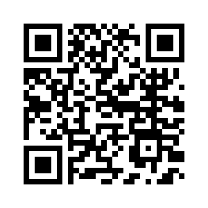
|
Shortened web links (URLs) and ‘Vanity’ Links (URLs)
Shortened web links is another way to simplify the process of accessing a webpage, as many web addresses are too long and complicated to type out in full. This can be helped by using a URL shortener which gives you a much shorter web link which will automatically redirect to the long website link. Examples of popular link shorteners include the following, each of which provides guidance on how to shorten a URL with their service:
These companies shorten URLs for free, but also offer paid versions that allow you greater control in what the shortened link will look like, such as including a recognisible word rather than random letters and numbers. These paid versions also offer the ability to track user metrics so that you will know how many people have clicked on a link.
A ‘vanity’ link is a web link that has been edited in a way that includes readable words, to help the user understand where the link will direct them and make it more memorable. This can be done using a paid link shortening service as mentioned above, but it is also something you can edit from the back end of your website. It is best to keep these as short and meaningful as possible. An example of this is the link we created for our previous project: https://www.law.ox.ac.uk/supporting-online-justice
Which is a lot more user friendly than the full web link: https://www.law.ox.ac.uk/supporting-online-justice-enhancing-accessibility-participation-and-procedural-fairness
About the Research Team

Dr Anna Tsalapatanis
Dr Anna Tsalapatanis is currently a Lecturer in Sociology and Social Policy at University College London. The research and writing of this guide were completed during her time as a Research Fellow at the Centre for Socio-Legal Studies at the University of Oxford. Her research interests include digital disadvantage, online justice, procedural justice, migration studies, citizenship as status, bureaucracy and identity. Anna received her PhD in Sociology from the Australian National University and a Masters’ Degree in Southeastern European Studies from the University of Athens.

Professor Linda Mulcahy
Linda Mulcahy is the Professor of Socio-Legal Studies and the Director of the Centre for Socio-Legal Studies at Oxford University. She specialises in research into how lay users experience the legal system. She has undertaken a number of empirical studies of disputes between businesspeople in the car distribution industry, divorcing couples, doctors and patients and neighbours on council estates. Her work has been funded by a range of bodies including the Economic and Social Research Council, the Arts and Humanities Research Council, the Nuffield Foundation, the Department of Health, the NHS Executive, the Leverhulme Trust and the Lotteries Board.
Acknowledgements
Writing this guide would not have been possible without the input and insights of the front-line advice workers who contributed to our focus groups and who gave feedback on the drafts of this guide. We are incredibly grateful for their time and assistance. Special thanks are due to Chilli Reid and Dal Warburton from AdviceUK; Martha de la Roche from the Network for Justice; the HM Courts and Tribunals Service LiPEG User Group; Alison Bergin and Julie Copley from HM Courts and Tribunal Service; Lindsey Poole from the Advice Services Alliance; and Julie Bishop from the Law Centres Network.

This research is funded by Oxford University’s Economic and Social Research Council’s Impact Acceleration Account (IAA) under reference 2202-KEA-758.